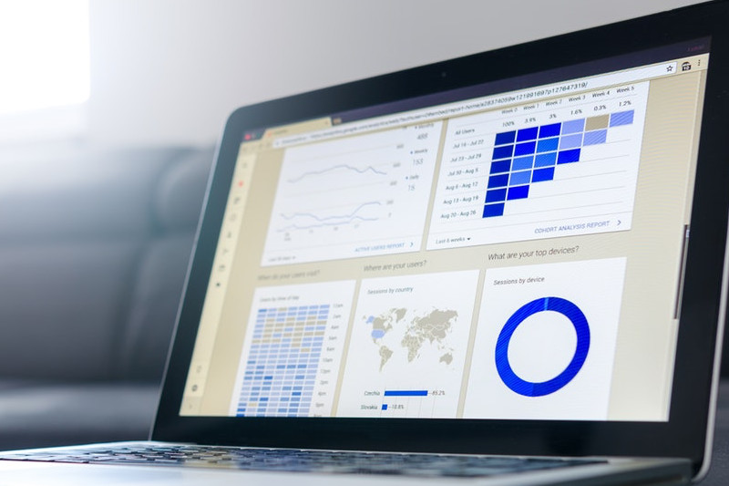
The Google Analytics Audience reports aim to give as much insight into who your users are and what context they interact with your site.
In our previous post, we covered the section of data in Google Analytics that focused on who your users were and where they were located. In this post we will focus on reports highlighting visitor interaction with the site and the technology used:
- Behavior
- Technology
- Mobile
Behavior Report
The behavior report is a section within Google Analytics that has slowly been transforming over the last few months. There are now four sub-categories within this report:
- News vs Returning
- Frequency & Recency
- Engagement
- User-ID Coverage
For a long time, the main focus of this section was New vs Returning visitors. This report allows an understand of how engaged visitors are with your site. You can quickly see what percentage of users to your site are new vs returning.
Depending on your business goals, this number can be used to help shape how you are managing your site content and digital marketing campaigns. As with the majority of google analytics reports the new vs engagement report should be segmented along with other data.
For example, if you are an ecommerce site, seeing a large number of new visitors adding items to cart but not purchasing them. You could create a remarketing campaign to target these users with a reminder to come back and complete the purchase.
Another example, if you are a blog and seeing a high number of return users, with high time on page numbers. You could segment these visitors out and learn more about the kinds of interests these audiences have. You could then create a marketing campaign targeting this same group of people. Aiming to generate more leads and increase site visitation from more of the high value audience.
The Frequency & Recency report breaks down the new vs returning numbers in more detail. It shows how many pages are viewed per session, giving an idea of the level of engagement new vs returning visits accrue.
It also shows how many times a user returns. This is shown in the “Count of Sessions” column. Breaking down the number of times a user returns to the site, by the number of users and page views per session. Very helpful in identifying the level of engagement your audience has with your site.
The Engagement report breaks down the session engagement by session time and page views. Very helpful in giving an indication on the level of engagement your users are having with the site. For example, this could highlight the health of a marketing campaign, ensuring sessions to the site are relevant. Demonstrated with a high time on page, or conversion rate.
The User-ID Coverage report will be covered in another post coming soon.
Technology Report
The technology report breaks down what technology is being utilized by your users. This report is then broken down into two sub-categories. First this is broken down by Browser & OS, then by Network.
The browser and OS report has a number of meaningful dimensions worth reviewing:
- Browser
- Operating System
- Screen Resolution
These reports can give a quick indication of the most popular browsers being used to view your site. These can also give an indication of engagement. As they include a breakdown of, users, new users, sessions, goal completion and goal value.
This can be used to give insight into the most valuable browser audiences. For example, a site could have more active Android operating systems, but higher revenue being generated from iOS operating systems.
The Network report breaks down the service providers of your users.
Mobile Report
The mobile report is broken down into two sub-categories. The first is an overview. Which breaks down visits based on, mobile, desktop and tablet.
Used on its own, this gives insight into the devices used on your site. However, used with other data it can highlight the technology most used by high value visitors. For example, on an ecommerce site, you can easily see which device generates the most revenue.
It can also be used along with Goal data, to see what devices add products to carts but don’t convert on purchases. This could then be used to tailor content and UX with the aim of increasing conversion for this audience type.
It can also be used along with the Source / Medium dimension. Giving greater insight into how these audiences, with high conversion and revenue have been acquired. This could then be used to focus more resources on these high value acquisition channels. Potentially demonstrating the opportunity to reduce funds or highlight the need for a strategy change for channels not performing well.
The second sub-report Devices can be used drill further down into the data. This report breaks mobile down into: Device, Mobile Brand, Service Provider, Input selector, OS and screen resolution.
These can help highlight the specific inputs certain devices are bringing to the business. For example, on an ecommerce site it shows the biggest drives of income are users browsing on iPads. Highlighting the importance of site managers to be reviewing how content is appearing on this device. Ensuring content and UX is optimized for this high value audience type.
These reports give another layer of meaningful data about your users. Used with other data sets in a thoughtful way, these reports can dramatically improve a websites performance and productivity.
This post is part of a series, see the previous post – What is Google Analytics Audience Report Part 2.
Another post covering the next section of the Google Analytics Audience report is coming. With more ideas on how this report can be used to improve business outcomes. Stay tuned.


